
01About
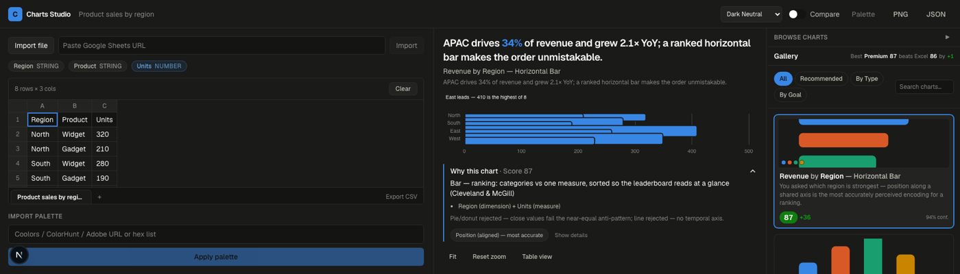
Charts Studio takes a dataset and returns a ranked, scored gallery of the best chart types for that specific data - driven by the correlations, outliers, and trends actually sitting in the rows, not a static enumeration of every chart type Excel ships. Every candidate carries a score, a stated reason tied to a specific finding, and a documented reason the chart types it beat didn't make the cut.
Situation. Excel's Recommended Charts and Tableau's Show Me both exist, and neither shows its work - you get a chart, not a reason. Every AI chart tool worth checking suggests a type from a text prompt, not from the actual statistical shape of the data in front of it.
Task. Build a pipeline that treats 'which chart' as a scored decision with a paper trail: gate every candidate against a real premium bar instead of a vibe, and ground the whole thing in an actual research pass - chart theory, the full Excel taxonomy, a validated color system, canonical good and bad charts - before writing a line of pipeline code.
Action. Wrote six research documents first, then designed the recommendation pipeline as six stages: Data Profiler, Pattern & Insight Analyst, Chart-Type Recommender, Design & Styling Generator, QA & Critique, Gallery Curator. Built the current version as a deterministic scoring and refine engine that mirrors those six stages' input/output contracts exactly, so the eventual LLM reasoning layer is a substitution behind the same interface, not a rewrite.
Result. Paste a table, get a ranked gallery in seconds. Every card is scored across six weighted dimensions - perceptual accuracy, color safety, data-ink ratio, anti-pattern checks, title quality, interactivity - and has to clear an Excel-style baseline by a real margin before it's allowed to rank at all.
02What Was I Exploring
Every recommendation tool worth reviewing either browses (Tableau's Show Me, Excel's Quick Analysis) or starts from a blank prompt (every AI deck or chart generator checked). None of them explain the why, and none of them are graded against a baseline the user can actually see side by side - a chart type either looks right or it doesn't, with no accountability for the choice. An explained, gated, baseline-beating recommendation is the gap this was built to fill.
The perceptual-accuracy tiebreaker (Cleveland & McGill: position beats angle beats color) directly decides which candidate wins when two chart types could show the same finding. Having that rule written down and checkable in code mattered more to the end result than picking a fancier charting library.
03Key Learnings
A recommendation without a stated reason is just a guess with better formatting. Every candidate's rationale field is mandatory output, not a nice-to-have caption - paired with a whyNot field that forces every rejected chart type to explain its own rejection. A gallery that can't say why it ranked something isn't a recommendation engine, it's a random chart generator with extra steps.
A quality gate has to be a number, not a vibe. gate() checks four independent conditions before a candidate is allowed to rank: score beats baseline by a real margin, score clears an absolute floor, color safety clears its own minimum, anti-pattern score is perfect. None of them is 'looks better than the last one' - that's exactly the kind of check that quietly stops mattering under deadline pressure if it isn't a number.
Six stages, not five or seven - collapsing any one of them loses a specific, named quality signal. Merging pattern analysis into recommendation loses the ranked why behind a suggestion. Skipping QA is the single biggest quality gap of all - it's the stage that catches the anti-patterns that look fine and are wrong. Merging curation into recommendation ranks chart types instead of chart instances, so a candidate that would fail QA can still win a ranking slot. Each stage earned its place by owning a distinct failure mode nothing else covers.
Mock now, swap later - building the deterministic version first was the actual unlock. Writing the rules-engine version against the same six-stage contract the eventual LLM pipeline needs meant the plumbing - scoring, gating, the refine loop, the UI - could all get built and tested before a single model call existed. The reasoning layer that's still to come is a drop-in behind that same interface, not a rewrite of everything built so far.
04Inner Workings
Six stages, one gate. A dataset goes in; a ranked, scored, gated gallery comes out. Nothing skips the gate.
Profile, analyze, recommend. Data Profiler infers each column's semantic type - a four-digit number could be a year, a zip code, or a currency value, and getting that wrong breaks everything downstream. Pattern & Insight Analyst runs a real deterministic core (correlation matrix, IQR-based outliers, skew and kurtosis, seasonality detection) and ranks the findings by narrative significance, not raw statistical magnitude. Chart-Type Recommender maps those findings to chart types using the Excel taxonomy and the FT Visual Vocabulary's goal categories, breaking ties with the Cleveland & McGill perceptual-accuracy ranking.
Generate, then gate. Design & Styling Generator fans out one instance per candidate, applying the fixed color formula, the six-checks colorblind validator, and the mark-spec rules from the design system. Every rendered candidate then has to clear scoreChart's six-dimension rubric and gate() before it goes anywhere near the gallery - beating an Excel-style baseline by a real margin, not just rendering without errors.
Refine loop. A candidate that fails the gate doesn't get discarded - it gets a specific fix mapped to whichever rubric dimension it failed (switch chart type, nudge lightness, add a hairline grid, drop a 3D effect, rewrite the title, add interactivity) and retries up to a capped attempt count before the loop gives up and reports the failure honestly instead of shipping it anyway.
Curate. Gallery Curator dedupes near-identical candidates, diversifies across findings instead of chart types, and orders the survivors by expected impact - the actual difference between a chart-type enumerator and something browsable.
05How To
No install, just a browser tab. A few ways in:
- Bring data: Paste a table, import an Excel or CSV file, drop in a Google Sheets URL, or load one of the built-in sample datasets.
- Read the gallery: Every card carries a score, a one-line reason tied to a specific finding in your data, and a why-not for the runner-up chart types it beat.
- Check the baseline: Use Compare to see the same data rendered as an Excel-style baseline chart side by side with the recommended one, and by how much it had to win by to earn a spot.
- Restyle: Swap in a Fluent UI v9 theme or an imported brand palette - every palette runs through the same six-checks colorblind and contrast validator before it ships.
- Export: Pull the finished chart as a PNG, or as JSON with the full reasoning trace attached.
06Expectations
This is a research-grounded lab, not a shipped product - there's no live deployment yet. The recommendation pipeline currently runs as a deterministic rules and scoring engine built against the same six-stage contract the research calls for; the LLM reasoning layer (semantic column typing, narrative-significance ranking, title and annotation writing) is designed but not yet wired in.
The reference corpus and research docs - chart theory, the full Excel taxonomy, canonical good and bad charts - are more complete than the UI built on top of them, by design. The docs were the first deliverable; everything else builds on that layer.
07Versions
- Aug 2026 — Research foundation. Six research documents shipped before any pipeline code: chart theory and purpose, chart anatomy and attributes, the full Excel chart-type taxonomy, a validated color and contrast design system, and a canonical good/bad chart reference corpus.
- Aug 2026 — Sprint 1: paste, gallery, score. Paste-to-table parsing, gallery view with score badges, Fluent v9 styling, and the first refine loop landed together.
- Aug 2026 — Combo charts and secondary axis. Auto-partitioned multi-series combo charts, an auto-interpreted secondary axis, and a reactbits-style compare slider against the Excel baseline.
- Aug–Sep 2026 — Agentic pipeline wiring. Workbook import, compare targets, separation strokes, a collapsible gallery, SSE-streamed pipeline runs with the refine loop live, and accessibility/performance test coverage.
- Sep 2026 — Polish. Fixed chart title and legend overlap, unified Fluent v9 styling across auto-partitioned combo charts.